Case study 02
RentFairly
Brand identityEarly-access page
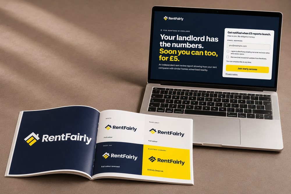
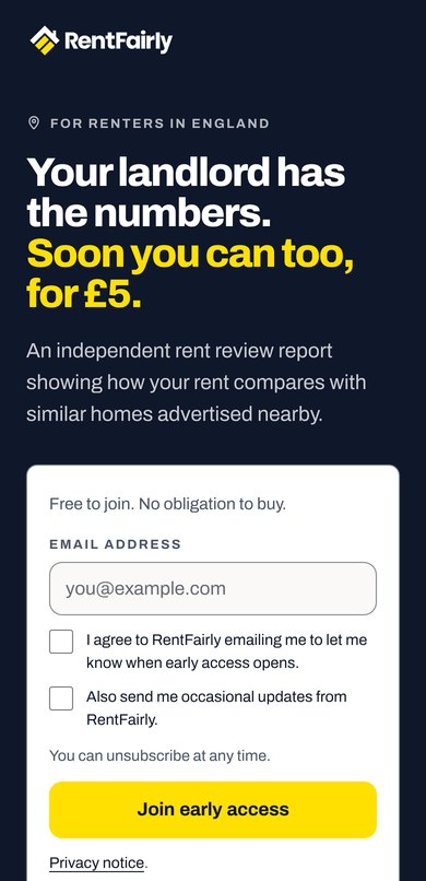
RentFairly is building a £5 Rent Review Report that shows renters in England how their rent compares with similar homes advertised nearby. I designed the brand identity and an early-access page, so renters can join the list while the full website and report are built.
A clearer picture of rent
The identity pairs deep navy with a bright yellow accent to make rental information feel clear and approachable. I carried that contrast through the early-access page, keeping the message focused and the sign-up easy to find.

- Deep Ink#0F172A
- Electric Canary#FFE000
- Page Grey#FAF9F7
Headings · Archivo, boldYour landlord has the numbers.
Text · ArchivoAn independent rent review report showing how your rent compares with similar homes advertised nearby.
Before they join the list
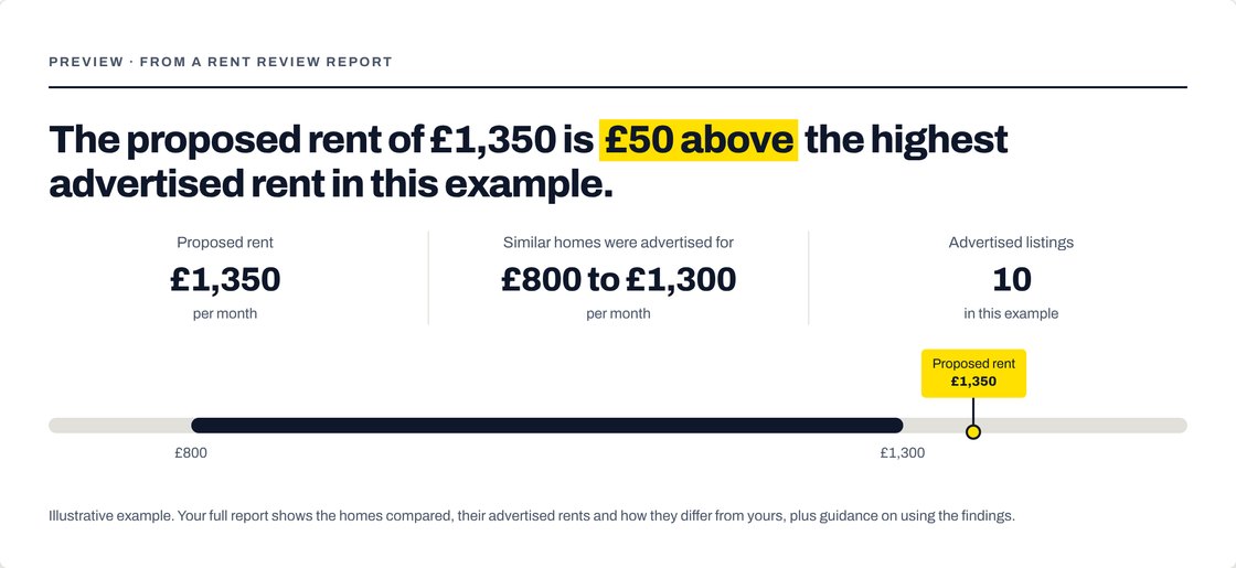
Someone curious about a rent report needs to see what they’d get before leaving an email. So the page shows an example: the proposed rent, what similar homes were advertised for, and where the rent sits between them. Joining the list is free, and the report itself will be £5.
RentFairly now has one page to share while the website and report are built. Anyone who joins gets an email the moment early access opens.
Launching something and need one clear page first? Read about my landing page design for launches.
Have a project in mind?
A few lines are plenty. I’ll reply within two working days.